

Key Takeaways
Dark Patterns
Dark patterns are intentional design choices built into websites and apps that steer users toward actions they didn't consciously choose - like signing up for a subscription, sharing more data than intended, or spending more money. They exploit how people naturally read and interact with screens, turning those tendencies against the user's own interests. The term was coined by UX designer Harry Brignull in 2010 to give language to what many shoppers intuitively sense but can't always name.
Regulators increasingly treat certain dark patterns as deceptive trade practices under consumer protection law. The FTC has issued guidance specifically targeting manipulative UI design in digital commerce.
What Makes a Design Choice a 'Dark Pattern'?
Not every confusing website is running a con. Bad design happens. But dark patterns are different: they require intent. A company's designers - or the third-party optimization tools they use - have specifically tested and chosen interface elements that increase conversions by overriding user preferences rather than serving them.
The defining characteristic is that the design benefits the company at a measurable cost to the user. A checkout flow that hides the total price until the last step, a newsletter signup that buries the decline option in gray text, a cancellation process routed through four screens of retention offers - these aren't oversights. They're the product of deliberate A/B testing.
This is worth separating clearly from persuasion. Showing customer reviews, offering a discount, or explaining product benefits are all legitimate ways to encourage a purchase. Dark patterns don't persuade - they obstruct. They make the outcome you don't want harder to reach than the outcome they want you to choose.
Understanding this distinction is the foundation of shopping more defensively in digital spaces.
The Most Common Dark Patterns You'll Encounter
While dozens of variations exist, a handful appear repeatedly across retail, subscription, and software platforms:
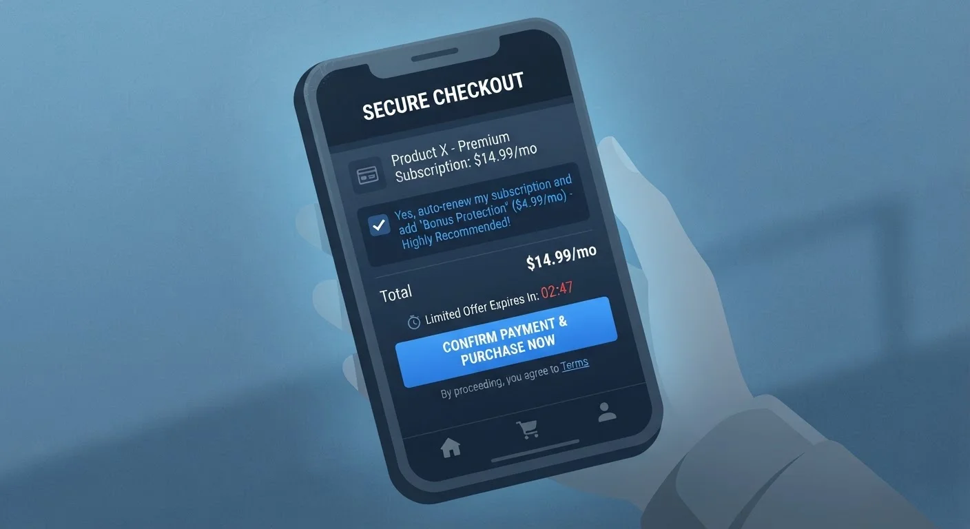
- Pre-ticked boxes: Add-ons, insurance products, or recurring subscriptions added to your cart by default. You must actively uncheck them - and many people don't notice.
- Hidden unsubscribe or cancel options: The "sign up" button is large and prominent; the cancellation path is buried in a submenu, requires a phone call, or sends you through multiple "are you sure?" screens designed to exhaust your patience. Subscription traps often rely on this exact friction.
- Fake urgency and scarcity: Countdown timers and "only 2 left!" warnings that reset or aren't tied to real inventory. These exploit loss aversion - the well-documented human tendency to fear missing out more than we value gaining something.
- Confirmshaming: Decline buttons written to make you feel foolish for saying no. ("No thanks, I don't want to save money" is a classic example.)
- Roach motel: Easy to get into, very hard to get out of - free trials that require a credit card and then charge without a clear reminder, or loyalty programs that don't allow easy opt-out.
- Hidden costs: Fees, taxes, or mandatory add-ons revealed only at the final checkout step, after you've already invested time in the process.
Pause Before You Click 'Continue'
Most dark patterns rely on checkout momentum - the tendency to keep clicking forward once you've started. Breaking that rhythm by pausing on each screen is one of the simplest and most effective defenses. If a page feels designed to rush you, that feeling is useful information.
These tactics often work in combination. A site might use a fake scarcity timer alongside a pre-ticked insurance add-on - stacking pressure so that you rush past the fine print. Artificial urgency and pricing psychology frequently appear together for this reason.
Why Dark Patterns Work - and Who They Target
Dark patterns are effective because they exploit cognitive shortcuts that all humans use. When a page is busy, we skim. When a timer is ticking, we rush. When the default option is pre-selected, we assume it's the recommended or standard choice. These aren't weaknesses unique to inattentive shoppers - they're universal features of how human attention works under normal conditions.
29
Dark pattern types catalogued by researchers
A 2022 study published in the ACM CHI Conference proceedings identified 29 distinct dark pattern categories across major shopping platforms.
1 in 10
Shopping sites using pre-selected add-ons
A Princeton University study examining roughly 11,000 shopping websites found dark patterns present across a significant share of top retail sites, with pre-selected options among the most common.
~$10B
Estimated annual U.S. consumer loss from negative-option billing
The FTC has cited figures in the billions when describing consumer harm from subscription models that use dark patterns to prevent cancellation.
Research in behavioral economics consistently shows that defaults are among the most powerful forces in human decision-making. People are far more likely to remain enrolled in something they were enrolled in automatically than to sign up for the same thing voluntarily. Dark patterns weaponize this tendency by making the company's preferred outcome the default.
The financial impact is real. Unintended subscription charges, unexpected add-on fees, and inflated cart totals add up - often in small enough increments that consumers don't notice immediately. This is structurally linked to reactive versus intentional spending: dark patterns push you toward the reactive end of that spectrum by design.
It's also worth noting that certain patterns disproportionately affect people who are navigating sites in a second language, have lower digital literacy, or are purchasing under time pressure - which raises broader equity concerns that regulators are beginning to address.
The Regulatory Landscape and What It Means for Shoppers
Consumer protection agencies have taken notice. The FTC has issued enforcement actions and policy statements targeting manipulative digital design, framing certain dark patterns as violations of Section 5 of the FTC Act - which prohibits unfair or deceptive acts in commerce. The FTC's "click-to-cancel" rule, proposed to address subscription cancellation obstacles, is one concrete example of regulatory response.
At the state level, California's Automatic Purchase Renewals law and provisions within the California Consumer Privacy Act specifically address dark patterns in consent interfaces. Other states have introduced similar legislation with varying scope.
Internationally, the EU's Digital Services Act and General Data Protection Regulation explicitly prohibit dark patterns in cookie consent flows and data collection interfaces.
“Dark patterns are tricks used in websites and apps that make you do things that you didn't mean to - like buying or signing up for something.”
— Harry Brignull, UX researcher and founder of darkpatterns.org, who coined the term in 2010
What this means practically for U.S. shoppers: you have more grounds than ever to dispute charges that resulted from pre-ticked boxes or undisclosed fees. Filing a complaint with the FTC or your state attorney general's consumer protection office is a real option - and aggregated complaints influence enforcement priorities.
It also reinforces the value of building deliberate financial habits. Limiting financial exposure from impulse or manipulated purchases is easier when you have systems in place - much like the approach described in building an automatic savings habit.
How to Read a Checkout Screen More Critically
Awareness changes how you interact with interfaces. Once you know what to look for, dark patterns become much easier to spot - and sidestep. A few practical habits:
- Slow down at multi-step checkouts. Every screen is a potential place for a pre-ticked add-on or a quietly inflated total. Read each page fully before clicking "continue."
- Check your cart total at each step. If the price increases between steps without a clear explanation, investigate before proceeding.
- Look for gray or small-font options. Decline buttons are often styled to be less visible than accept buttons. Scan the full page, not just the prominent call-to-action.
- Be skeptical of urgency. A countdown timer does not obligate you to rush. If a deal requires you to skip reading the fine print, that's a reason to pause, not accelerate. Anchoring and decoy pricing work similarly - they distort your sense of what's reasonable under time pressure.
- Research the cancellation process before subscribing. If you can't easily find how to cancel a trial or membership before you sign up, that's a meaningful signal about what the experience will be like after.
None of these steps require technical expertise - just the habit of treating checkout as a process that deserves the same scrutiny you'd apply to signing a contract, because increasingly, that's exactly what it is.